Best Instagram profile picture – that’s our today’s mission! As you already know (hope so!): we want to make this blog your most reliable and trustworthy information source about how to optimize your Instagram profile – whether it’s personal or business-oriented.
Today, we’ll focus on the next crucial factor: to grow your Instagram, it all starts with a profile photo that grabs attention, turns heads, and makes people intrigued. We’ve recently covered the best methods to set up your first account, but you should also know how to stand out among more than 100 million active accounts on the platform.

Your Instagram profile picture tells your potential followers many things that they want to know before they decide to consume your content and follow you. Can they relate to you? What are you exactly doing? What is your niche? Does your brand reflect their ideals? Yes – all of this information can come from a small, round photo. The reason is simple: it’s the first impression you give someone when they click on your profile – it’s an essential part of your branding. So you’ll want it to stand out in a way that makes the visitors curious and makes them realize how unique the profile they’ve just discovered is.
Let’s talk about all the best practices for choosing your profile pictures for Instagram.
Are you ready to craft an Instagram profile photo that convinces visitors to click the “follow” button? What should it be, to represent you or your business in the best way?
Let’s dive deeper into how to create the best Instagram profile picture: the one that will speed along your account’s growth.
Protip: You can use these recommendations for your personal and professional profiles on all social networks, not just Instagram – they apply to Facebook, Twitter, Linkedin, Tumblr, or Clubhouse as well.
Best Instagram Profile Picture – should it be a personal photo or your brand’s logo?
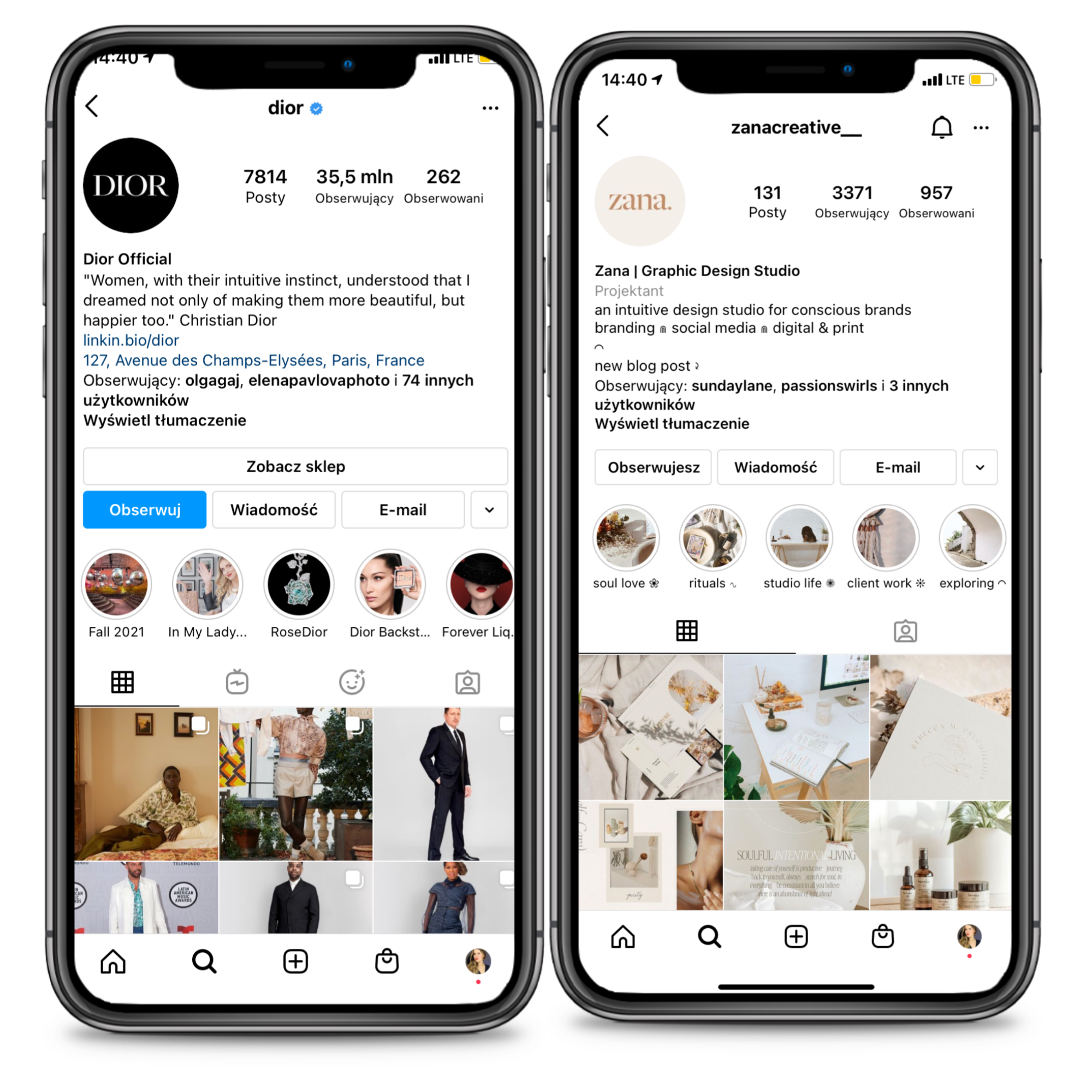
Before getting to the heart of the matter, let’s answer a question that comes up at the very beginning: should you use your brand’s logo or your personal photo? Logos are great if you run a business other than a personal solopreneur’s brand. If you’re a one-person show, you might want to stick with a photo that clearly shows your face and personality.
To elaborate on that: if your Instagram account is for a business – even if it’s a micro-business – we highly recommend that you use your logo as your profile picture. In fact, as soon as your profile is created, you should do everything to ensure that your potential clients recognize your brand. A logo is the part of your branding that people remember and recognize most efficiently – and you should benefit from that.
However, if you want to create your personal brand as a blogger, content creator, or public figure, then it is DEFINITELY better to use this space to display the photo of you.
If you go for a photo, you will also need to think about how it will work with your overall branding. What are the colors and branding aesthetics you use? Always remember that your Instagram profile picture should reflect your branding to preserve consistency in your visual online presence.
Protip: An easy way to do this is to wear a branded color (for example, wear a purple shirt if your brand’s palette contains this color).
A bunch of other practical (and game-changing) tips:
If you have chosen to use your logo as an Instagram profile picture, here are some matter-of-fact recommendations to keep in mind:
- Your logo should be big enough but have some space around it to – as graphic designers often say – breathe. It’s just more aesthetically pleasing this way.
- Add your logo on a solid background to avoid unwanted distractions.
- If your logo is too big or contains too many details (so it looks defective in such a small size), consider using the minimal version of it or your favicon.
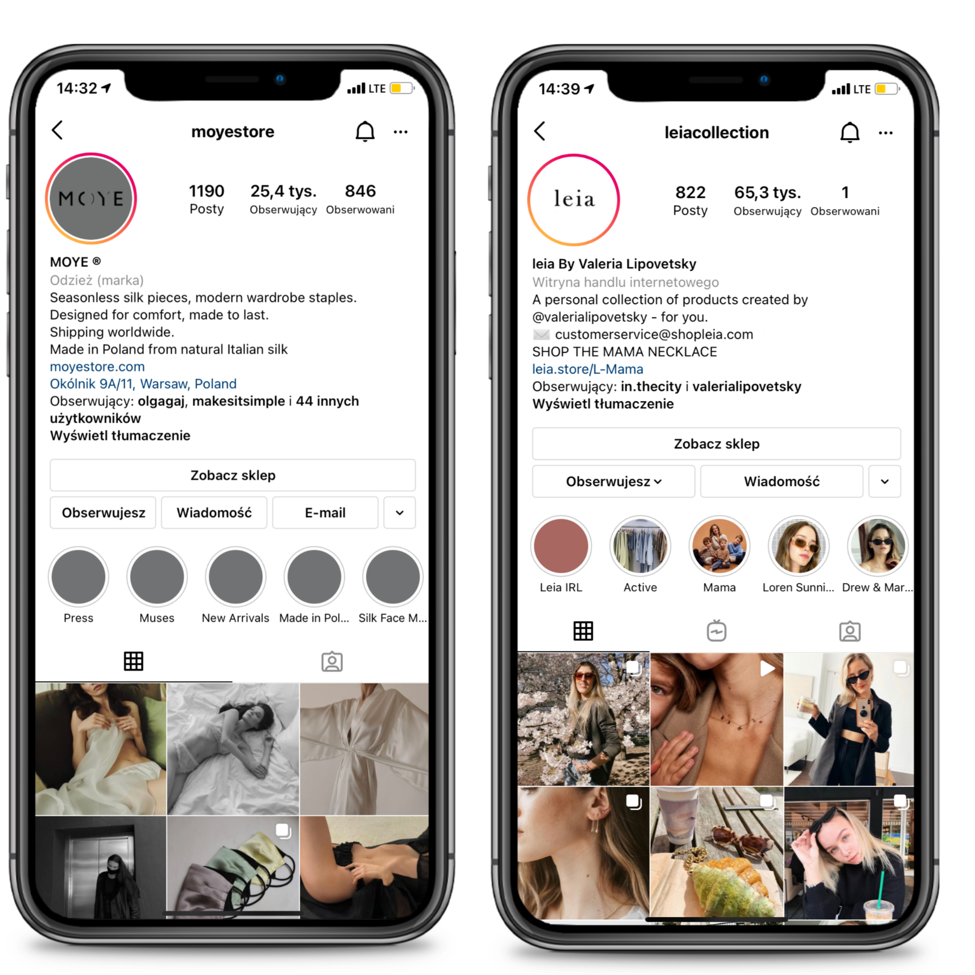
Best practices for your Instagram profile picture when it’s a photo:
- Focus on your face: it should be visible.
- It’s better to use a portrait rather than a full-body photo of yourself. Instagram profile picture measures 110px x 110px in the app – it is therefore relatively small. In fact, it’s too small to notice and remember your face if you use this space to display a full-body photo of yourself.
- The best dimensions to avoid compressing? We recommend that you import a square photo of at least 512px by 512px for good quality. Instagram tends to compress images to such an extent that they lose quality. Uploading a photo of at least 512px by 512px, you can reuse it on almost any social network without having to worry about the dimensions.
- You don’t have to stick to square proportions initially, but it helps if your photo is already cropped into a square. Just to make sure you cut it exactly where you want. Anyway, if you’re using a portrait or landscape photo, Instagram will allow you to crop it before it appears on your profile.
Ideally, we would tell you to focus on photos of your head to shoulders. It allows you to have a photo that shows your face well without the impression that it’s “too close and too overwhelming”.
Protip: Test multiple angles and distances because every face is different – and you have to figure out which angle or distance is the one best working for you. Angles and positioning can make profile photos look more professional and attractive, so don’t be afraid to experiment with many different options. In most cases, a slight tilt of the head can make you look more sincere and accessible – give it a try!
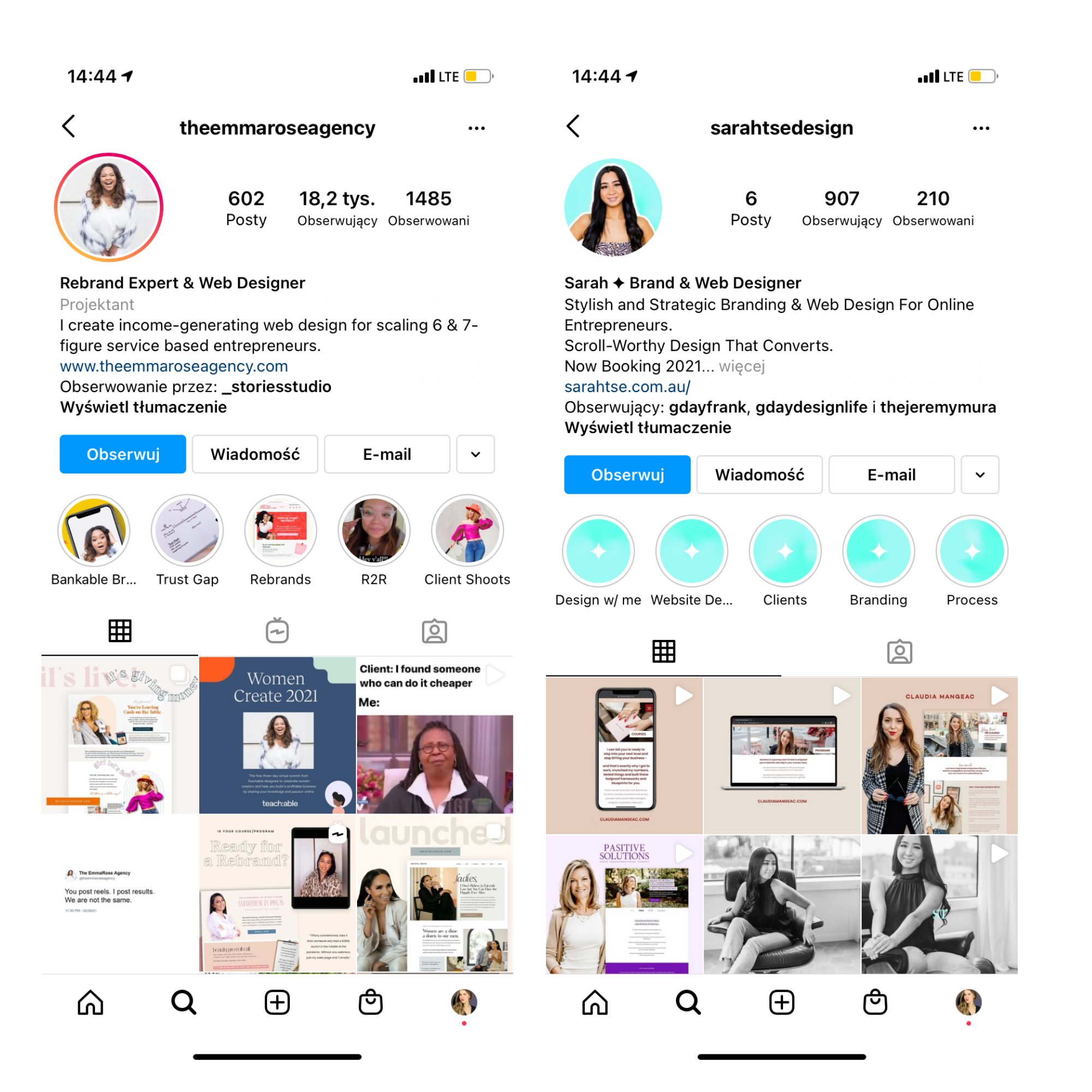
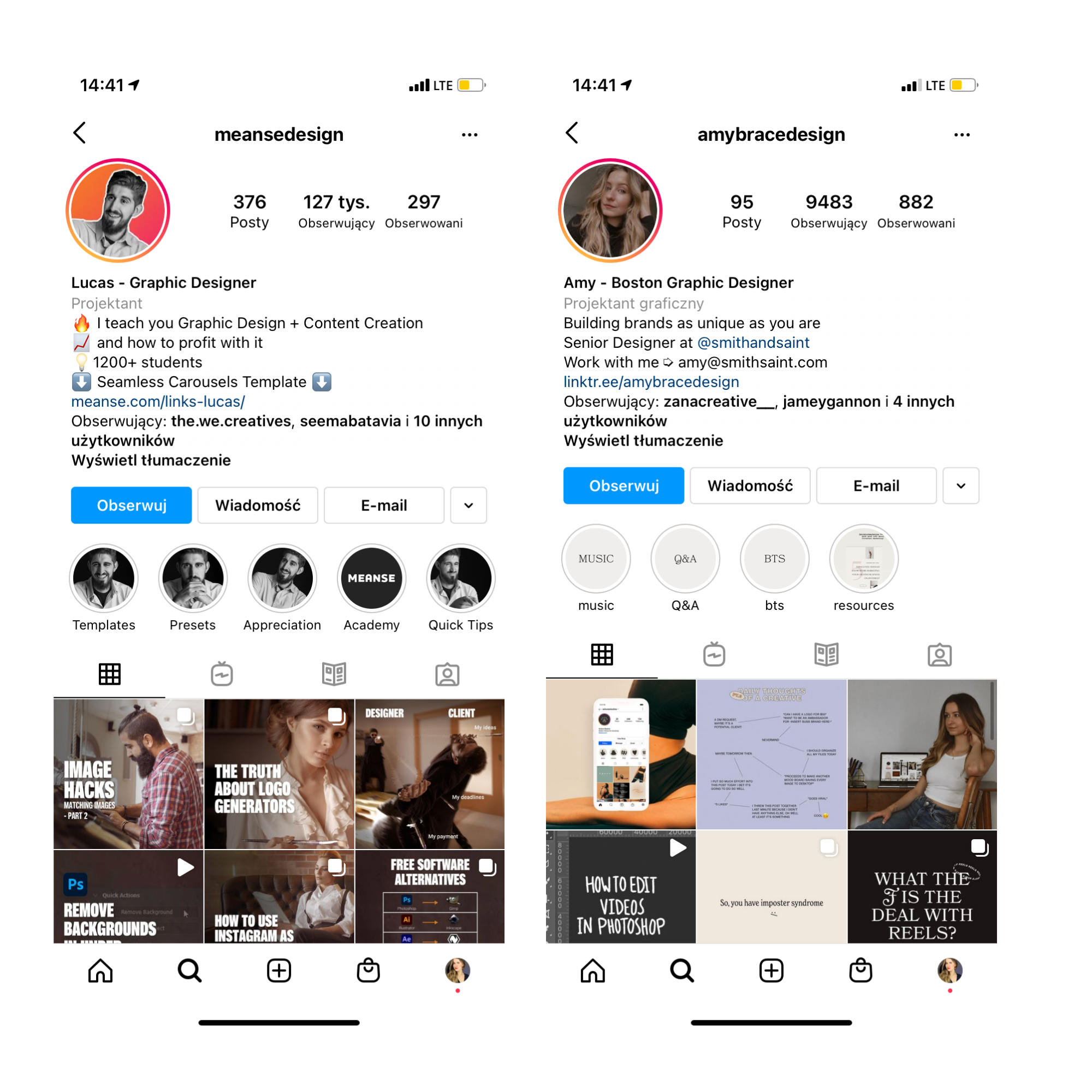
Good example: How can it look like? Let’s take a look: here we have the examples of a well-optimized profile photos in which we can clearly see the author’s face – so they accomplish the mission of a well-crafted profile pictures for Instagram.
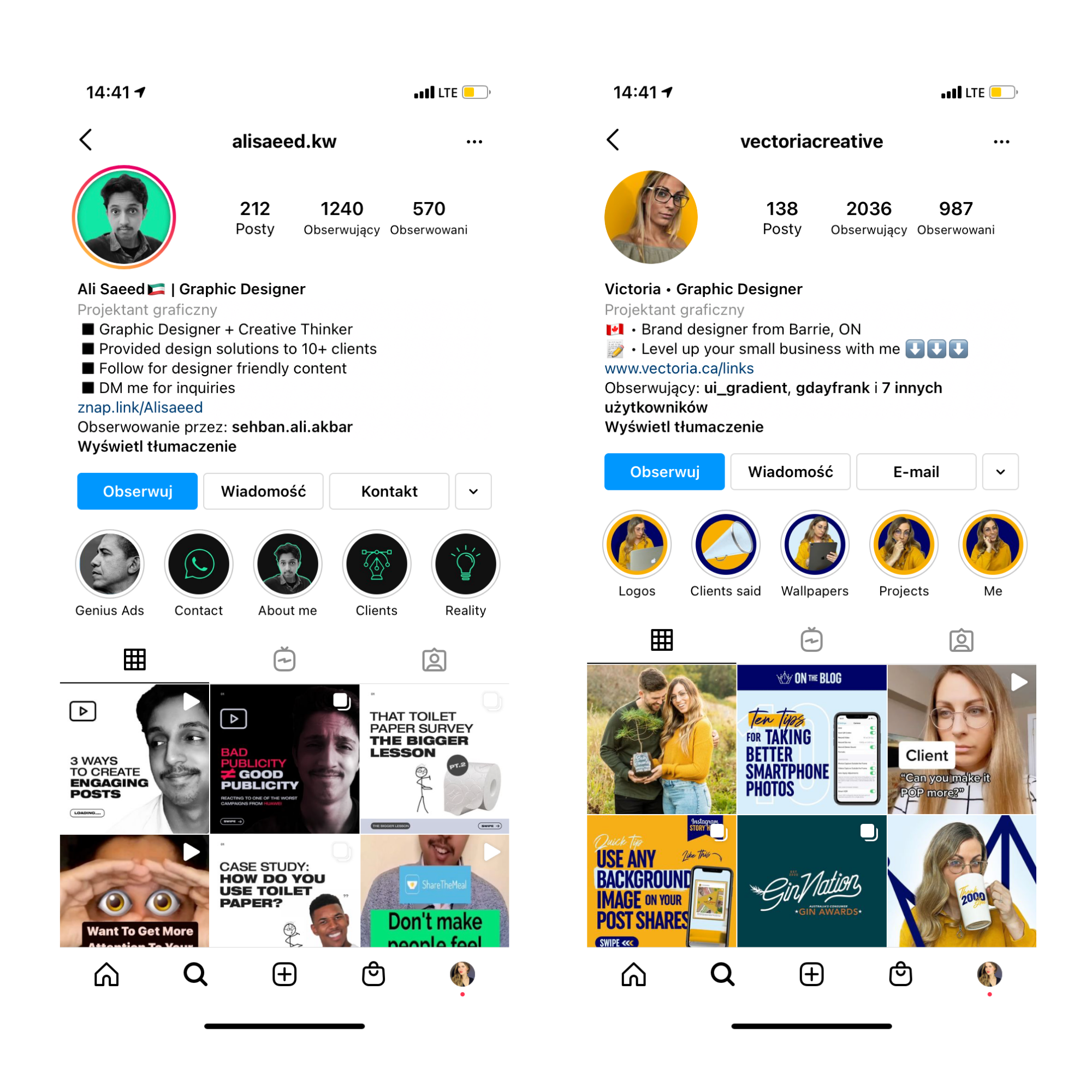 Rules to remember when taking your new, wooing profile photo:
Position yourself in the center of the photo
Keep in mind that Instagram displays your profile photo as a circle, so you’ll need to be careful about the position of your photo’s focal point towards the center, so nothing important is cropped awkwardly. Details in the four corners of the image will not be visible. The solution? Position yourself in the center of the photo to prevent specific details from disappearing.
Use a plain background
We recommend that you always take your photo on a solid AND neutral background to make your face stand out as much as possible. Using a solid background on your photo removes any form of distraction. The effect? It’s easier to remember it, and that’s exactly what we want to achieve (from a strategic point of view).
Pay attention to the lighting
As you probably already know, in photography, lighting is super important. For your photo to be eye-catching, it must be exposed correctly so that the face and colors appear clearly.
Natural lighting is generally the way to go for effortless, professional-looking photos. Take your photos outdoors or find a sunny spot in your home to take them. Experiment with and without the flash to see what it looks like, but from our experience: you will often find that skipping the flash light can help you get more natural and fresh-looking photos.
Here are some golden rules and take-aways from this part:
- Make sure your photo is sharp (not blurry)
- Whenever it’s possible, take your photos using natural light, which is more flattering and easier to edit in post-production.
You can use photo-retouch apps to enhance your photo, but don’t overuse them.
There is nothing wrong with modifying or retouching a photo to make it look better, whether you brighten it up in Lightroom or add a filter to it. For all that, you should avoid going too far with filters and modifications that make your image look edited. The key to good retouching is to make the image look better as well as natural!
There is a bunch of free apps to help you edit your photos. Here is the list of photo editing apps we personally use: Lightroom Mobile, Canva, VSCO, Snapseed, PIXLR, and good Instagram Photoshop actions.
Use them to adjust saturation, brightness, or contrast to make your image look more professional. If you want to add a filter, use just one rather than stacking different and intensive ones, making your photo look grainy and distorted.
Don’t change your Instagram profile picture too often
Stick with a photo that doesn’t require frequent updates.
It may take a while for your followers to remember (and then recognize each time, for example, in the Instastories section) your Instagram profile picture. Ideally, you would like them to recognize your face from the hundreds of other faces they see EACH DAY. This is how they will instantly recognize your stories, and hopefully for you, watch them first.

Now you know how to take and choose the best Instagram profile photo! It may seem like such a small step towards the bigger goal, but believe us – it’s a pivotal part to make your account work in your favor.
Stay tuned for next Instagram Lesson! We want you to get into the art of driving sales with Instagram, as well as the mastery of increasing the visibility of your brand or business. You don’t have to wait until you have 10 000 followers to observe significant results and get impressive feedback from your followers. Well-optimized, encouraging business profile is a crucial part of your online presence and your digital marketing strategy, never underestimate that. We know: Instagram may seem a little bit complicated or even intimidating at first, but we promise – with the right guidance, you’ll learn everything quicker than you imagine.
- Instagram SEO Explained: Instagram Has Changed Because of Instagram Keywords - October 16, 2023
- Instagram Search Engine Optimization: Identify Best Hashtags and Avoid Banned Hashtags - June 26, 2023
- Boost Your Instagram Presence: Uncover Insights with IQ Hashtags Instagram Profile Analysis - June 26, 2023
