Instagram carousels can become your top strategy… If you know how to create them! Let’s face it: the main goals of your beautiful graphics and polished carousels include attracting new followers, boosting sales, creating a sense of community and engagement with the audience, expanding the reach of your personal brand, and establishing your credibility as a brand expert in your niche. The graphics you post on Instagram can effectively achieve these goals and build your Instagram account identity – we’ve experienced it ourselves, too!
If you have attempted to use graphics to grow your profile but faced challenges, or if you are considering creating and posting more Instagram graphics but are still trying to figure out where to start, this guide is for you (woo-hoo). By avoiding common mistakes, you can unlock the potential of carousels and Instagram graphics and use them the smart way to boost your growth.
Today, we will discuss the common mistakes that creators, influencers, and business owners make and provide tips on overcoming them to create powerful and strategic ‘Gram graphics. Let’s dive in!
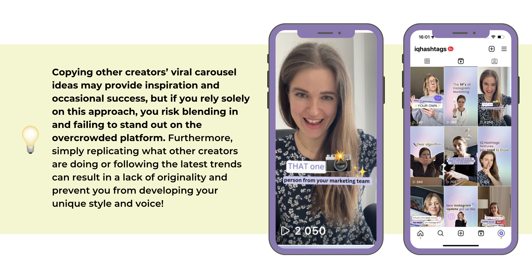
Copying other creators’ viral carousel ideas may provide inspiration and occasional success, but if you rely solely on this approach, you risk blending in and failing to stand out on the overcrowded platform. Furthermore, simply replicating what other creators are doing or following the latest trends can result in a lack of originality and prevent you from developing your unique style and voice!
My advice? Instead, aim to add your own spin and experiment with new ideas to differentiate yourself from the competition. Rather than focusing on what your competitors are doing, prioritize understanding your target audience and creating content that resonates with them.
Consider their current thoughts, feelings, desires, and struggles, and look for ways to tap into those elements in your carousels. Look beyond graphics for inspiration as well, and explore the real world for ideas! By thinking outside the box, you can develop your own unique content creation style that sets your profile apart.
You aren’t diversifying your ideas
If you solely rely on posting one type of Instagram graphic, such as entertaining or educational, you may eventually exhaust your audience and hinder your growth in other areas.
A healthy mix of content types and graphics is necessary for overall healthy growth on the ‘Gram. This includes viral graphics for audience expansion, sales graphics to promote your great offers, educational carousels to showcase expertise and offer value to the audience, and relatable graphics to build community and establish deeper connections with the audience. It’s totally normal to focus more on a particular type of graphic during specific periods, but it’s essential to add variety and not overdo one type.

You’re afraid to get these creative juices flowing
Let the visual aspect of your Instagram graphics work to your advantage by using creative elements such as color, typography, layout, illustrations, animations, and lines to make your carousels stand out.
Take advantage of infographics and illustrations or even creative mockups to bring your message to life or explain things in an interesting way. You can also use creative layouts for simple things, such as featuring a quote on a notification pop-up or displaying a list on an illustrated notepad design – the possibilities are endless!
There are so many numerous possibilities for being imaginative. This is especially crucial when it comes to sales carousels. It’s your opportunity to grab your audience’s attention and get them excited by using not only words but also visuals. Consider how you can make your message compelling, exciting, and visually appealing to make it all feel more tangible.
Your carousels aren’t staying in your followers’ minds (long enough)
To succeed in a crowded market, it’s crucial to establish a unique content identity, style, and voice. If your carousels blend in with everyone else’s, it will be harder to gain traction.
Start by defining your content style and messaging, then look for ways to differentiate yourself from competitors in your niche. For example, if the norm is pastel colors and cursive fonts, try using bold, serif fonts and darker hues. Or if the niche is serious and formal, inject some humor or playfulness into your graphics. Remember the Von Restorff effect, which states that people are likelier to remember things that stand out from the crowd.
To test this, search for relevant hashtags, analyze what makes other carousels similar, and consider how you can create something distinctive and more memorable.
You don’t know who you’re trying to attract and who you’re talking to
If you don’t have a clear idea of who your target audience is, and you just post whatever comes to mind, you may find that you attract the wrong people or struggle to connect with your intended audience!
By understanding your target audience’s needs, desires, and emotions, you can create content that resonates with them and encourages REAL engagement. However, if you fail to identify your target audience, you may attract individuals who are not interested in your content and your services. Additionally, it’s crucial to avoid creating content solely for your industry peers, as they are often unlikely to become paying customers.
Protip: analyze your current audience and their behaviors using the IQ Hashtags’ Followers Analysis Tab. That way, you can dive into metrics that matter the most and track if you’re attracting the right kind of followers – your target audience.
You face creative block but are afraid to use the help of AI
I totally understand – the introduction of new and advanced technology is not always seamless. I hear that many of you are genuinely afraid of being replaced by AI. As a marketing expert and content creator myself, I was also somewhat fearful about AI taking over my duties, I won’t lie about it!
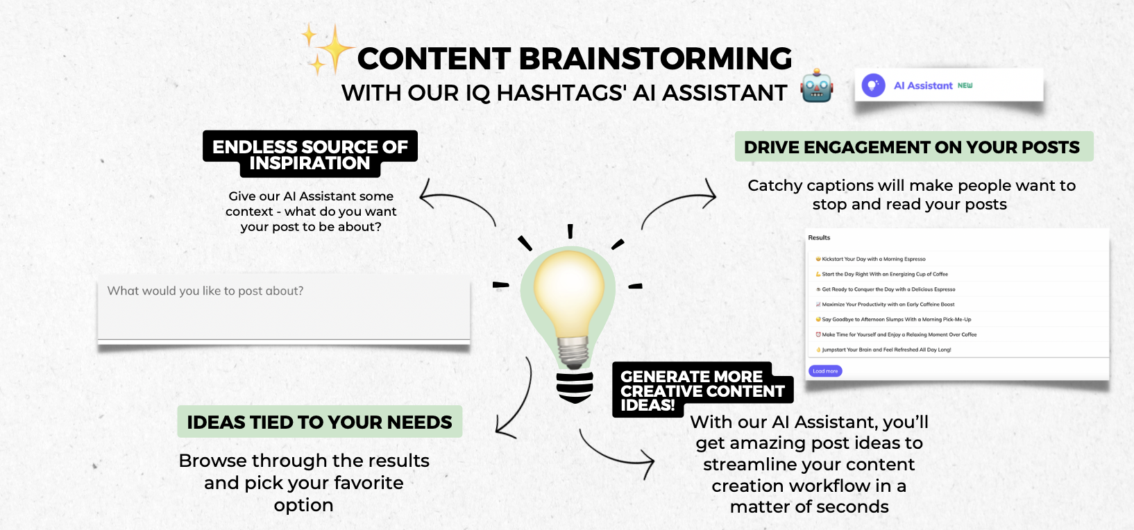
Nevertheless, now I know: rather than fear it, it is high time to embrace AI. For example, you can beat your creative block with IQ Hashtags’ AI Assistant or Caption Generator. My tip? Go for it. Explore new ways to integrate this helpful AI into your daily workflow.
Now AI gives people a confidence boost about their capabilities and makes their work more effective. I wouldn’t recommend something I don’t believe in myself – but I’m witnessing it every day how powerful it can be when it comes to developing your content briefs and helping you beat the blank page syndrome. It will basically help you focus on the part of content creation that genuinely excites and matters to you – you’ll be surprised by the results.


Comments are closed.